
6.12 Judicial Analytics in Motion
Publish date: 12 June, 2022
Publish date: 12 June, 2022
Role: Motion Designer & Data Architect
Focus: Transforming static judicial archives into a 4-minute dynamic data narrative
Key Expertise: Motion Graphics, Information Hierarchy, and Data-driven Animation
Focus: Transforming static judicial archives into a 4-minute dynamic data narrative
Key Expertise: Motion Graphics, Information Hierarchy, and Data-driven Animation
Project Brief: Following the static infographic "The 6.12 Archive," I was tasked to architect the motion language for this 4th-anniversary investigative video. My goal was to synthesize complex judicial outcomes—including conviction rates, sentencing distributions, and projected release timelines—into an intuitive visual flow.
Design Strategy: "Beyond the Footage"
As the lead for all non-footage elements, I developed a systematic visual identity for the video. This involved:
Animated Data Transitions: Using motion to represent the transition from "Arrests" to "Convictions," making the legal process easier to grasp for a general audience.
Temporal Forecasting: Visualizing the "Expected Release Date" data, transforming future projections into a clear, animated timeline.
Consistency in Clarity: Ensuring that high-density graphics remained legible and aligned with the brand's analytical tone throughout the fast-paced motion narrative.


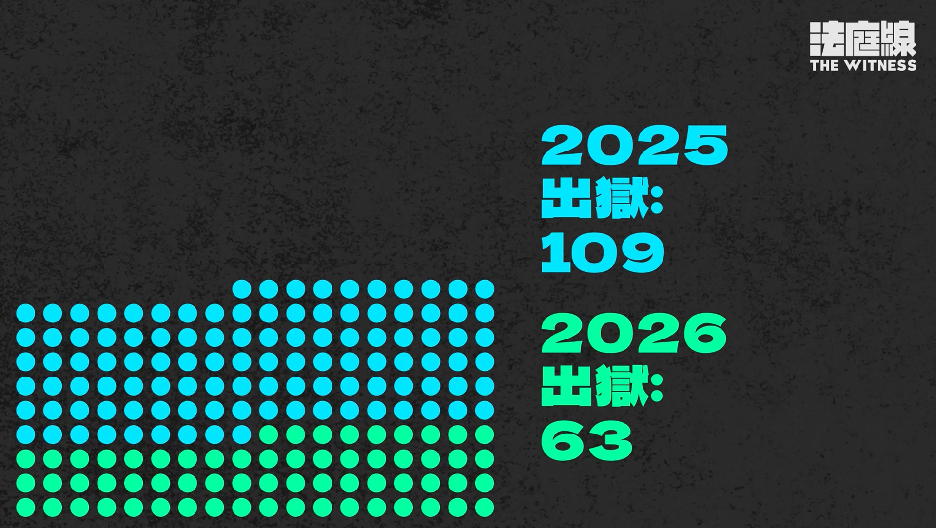
A visual set animating the projected release of 382 rioting case defendants. The waffle chart matrix decays sequentially, visually representing numerical reduction across time cohorts from late 2023 through 2026.