
Meteorological Data & Social Correlation
Publish date: 13 October, 2021
Publish date: 13 October, 2021
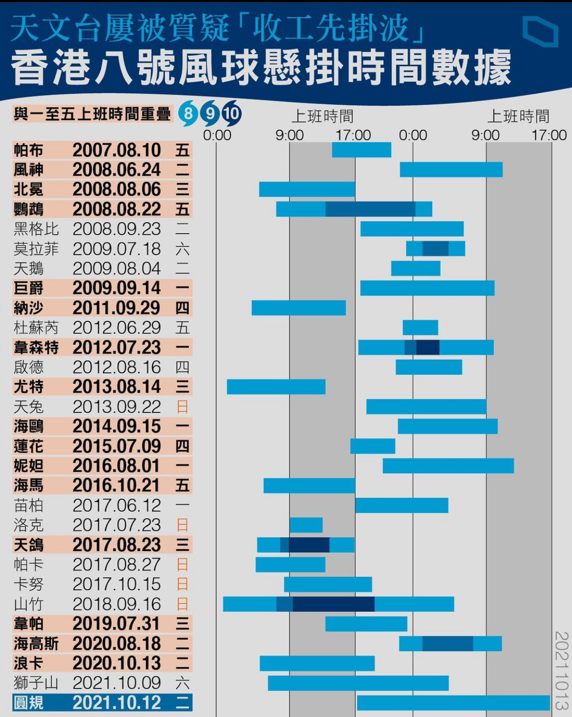
(Left) Temporal Analysis: Typhoon Signal No. 8
A Gantt-style timeline correlating the duration of Typhoon Signal No. 8 signals with standard office hours (09:00–17:00) from 2007 to 2021. This visualization provides a quantitative perspective on public perception vs. meteorological reality, highlighting the specific overlaps between severe weather events and the urban workday.
A Gantt-style timeline correlating the duration of Typhoon Signal No. 8 signals with standard office hours (09:00–17:00) from 2007 to 2021. This visualization provides a quantitative perspective on public perception vs. meteorological reality, highlighting the specific overlaps between severe weather events and the urban workday.
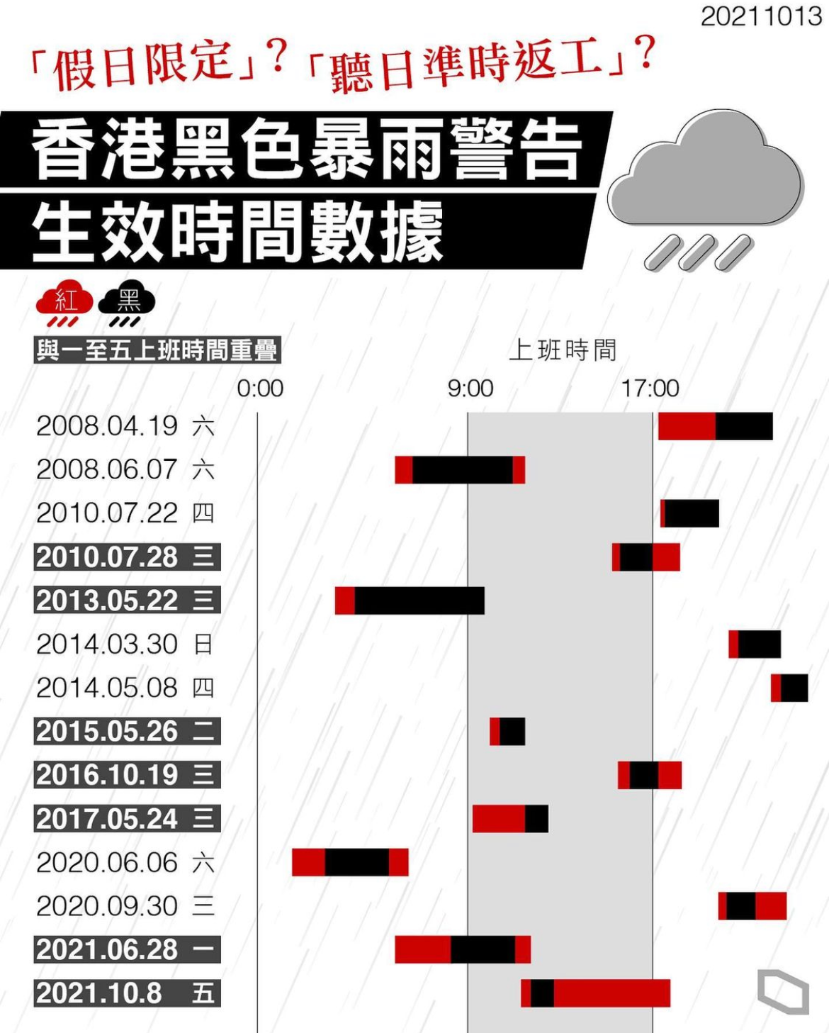
(Right) Impact Mapping: Black Rainstorm Warnings
A chronological study of Black Rainstorm Warning durations and their transitions from Red warnings. By mapping these events against a working-hour grid, the chart illustrates the frequency and timing of extreme precipitation, offering a data-driven look at how weather warnings disrupt or align with societal productivity.
A chronological study of Black Rainstorm Warning durations and their transitions from Red warnings. By mapping these events against a working-hour grid, the chart illustrates the frequency and timing of extreme precipitation, offering a data-driven look at how weather warnings disrupt or align with societal productivity.